Designing with code
Code has always felt like a natural creative medium to me. Maybe it’s that I went to school for engineering, not art or design.
The OpenAI Gradient: Year in Review 2020
When an idea is defined by a set of rules, you can generate endless variations, dial in parameters to your heart’s content, and systematically converge on the strongest solution.
Instead of individual assets, you design systems. A single idea (like randomized color gradients) can scale across many applications while maintaining a consistent visual language.
The medium itself also reveals new possibilities. Code doesn’t just make design more efficient — it expands what a design can be.
Historically, these virtues didn’t come for free. They came with a significant upfront investment.
You had to learn to program first, of course. Then, before you could even begin the creative work, you had to build the underlying framework. Finally, after everything was in place, you had to write and edit code by hand to explore different branches of an idea.
This friction kept many ideas from ever getting off the ground.
“If there is any delay in that feedback loop between thinking of something and seeing it and building on it, then there is this whole world of ideas which will never be.”
— Bret Victor, Inventing on Principle (2012)
In the age of AI, agents can handle the implementation faster than I ever could. (I never liked coding much anyway; I only liked what it enabled.) Now instead of writing code, I’m free to explore possibilities with the agent — directing, experimenting, asking “what if?” again and again as an idea comes to life.
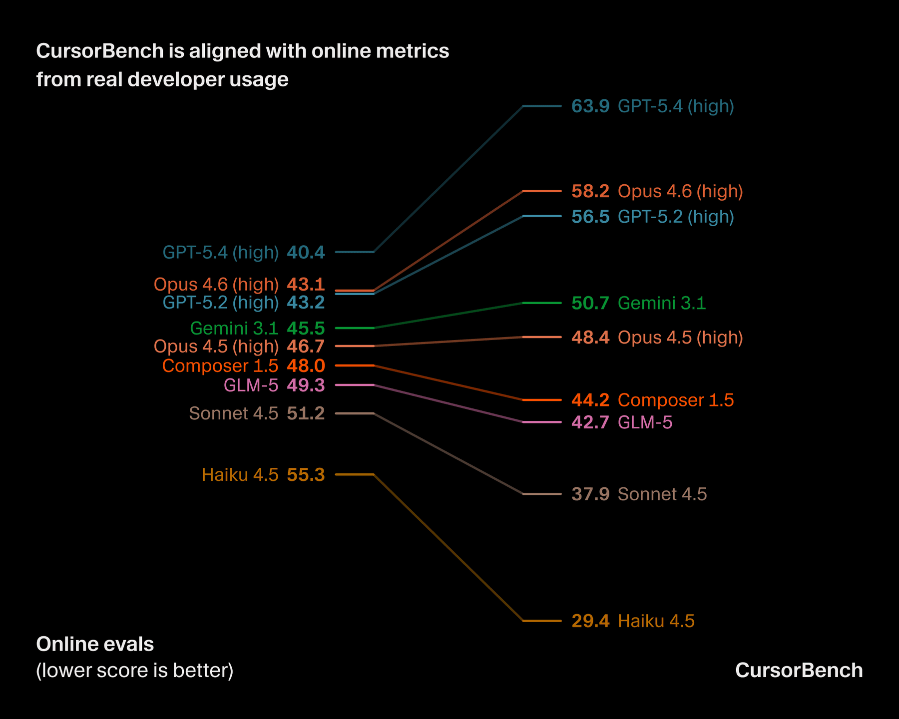
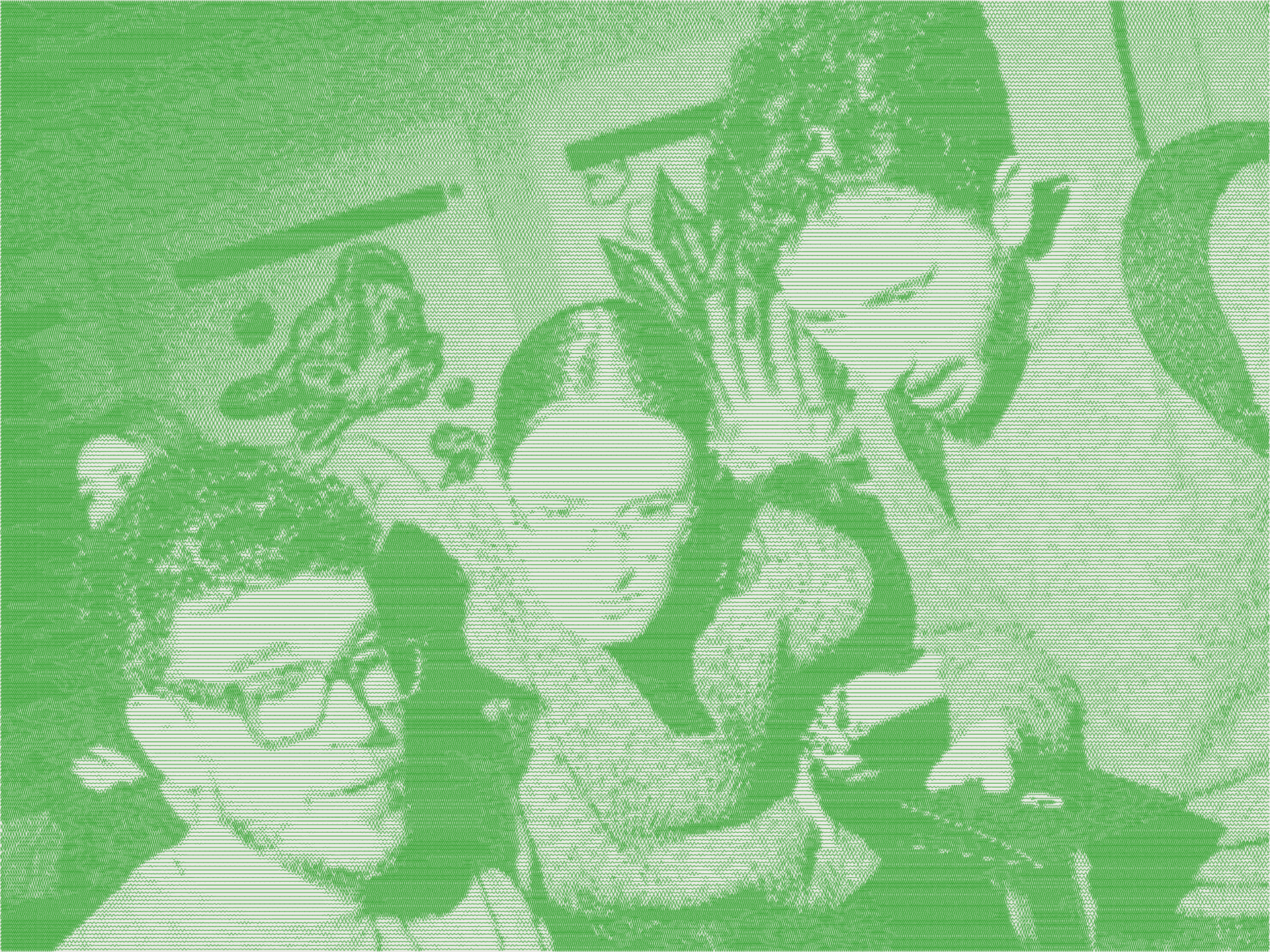
Creating feels more intuitive, immediate, and fun than ever. Across our design team, code has become integral to exploring and producing work. I reach for Cursor to design not just interfaces, but graphics, charts, posters, logos, and animations. Below are a few pieces from earlier this year.
Securely indexing large codebases
How we compare model quality in Cursor
Introducing Composer 2
Training Composer for longer horizons
Improving Composer through real-time RL
One of my favorite pieces above is the header graphic for the blog post, “Improving Composer through real-time RL.” Reinforcement learning, or RL, is built around repeated cycles of feedback, so a gear system felt like a nice visual metaphor. Here’s a look at how the design came together in Cursor through selected prompts from the conversation.
- First, we scaffold a blank canvas and reference the code setup of past graphics.
let’s create a new blog header graphic. it’s for the same post as those other charts, called “Improving Composer through online RL”. reference what we do for other blog-*.py scripts. let’s start with black on white blank page to start. then i’ll instruct you what we should draw
- Next, we define the language for the gears.
i want to do a line drawing . . . inspired by this image with gears. instead of full gears, do a simplified abstract representation with just radial lines.
let’s only do perfectly circular radial lines. and we can dial in the inner circle and outer circle for each of the 3 gears . . . the middle gear should consist of two concentric but different sized gears (like a double gear).
as a rule here in this abstract gear world, i want intersection of the gears to be where the lines are halfway into each other.
great! but it’s too wide now, maybe you need to adjust the sizing so it works. maybe the S and M need to be smaller after all?
oh awesome. but should be a larger hole. and in general the outer circles need to be larger too. for the rightmost one, let’s increase until the inset 96. having a small delta between outer circle and inner hole gives it a less sun quality, and higher gear quality. less radial, more gear-like.
can you offset the rotation so that the lines don’t ever intersect? like gear teeth fitting together.
- With the language in place, we work through the details of the composition.
since we have overlapping gears due to the larger outer gear being in the background . . . what does it look like to “crop out” the left gear’s background?
much visually cleaner. but is there any way to remove the partial lines? only show the line if it’s fully not cropped.
perfect. now let’s dial in the densities. the spacing should roughly optically look the same. but can you improve the density formula? should be dependent on inner/outer radius/overall size.
i want the left gear to intersect with the outside of the middle gearset. then the right gear needs to intersect with the inner of the middle gearset. it’s reversed right now.
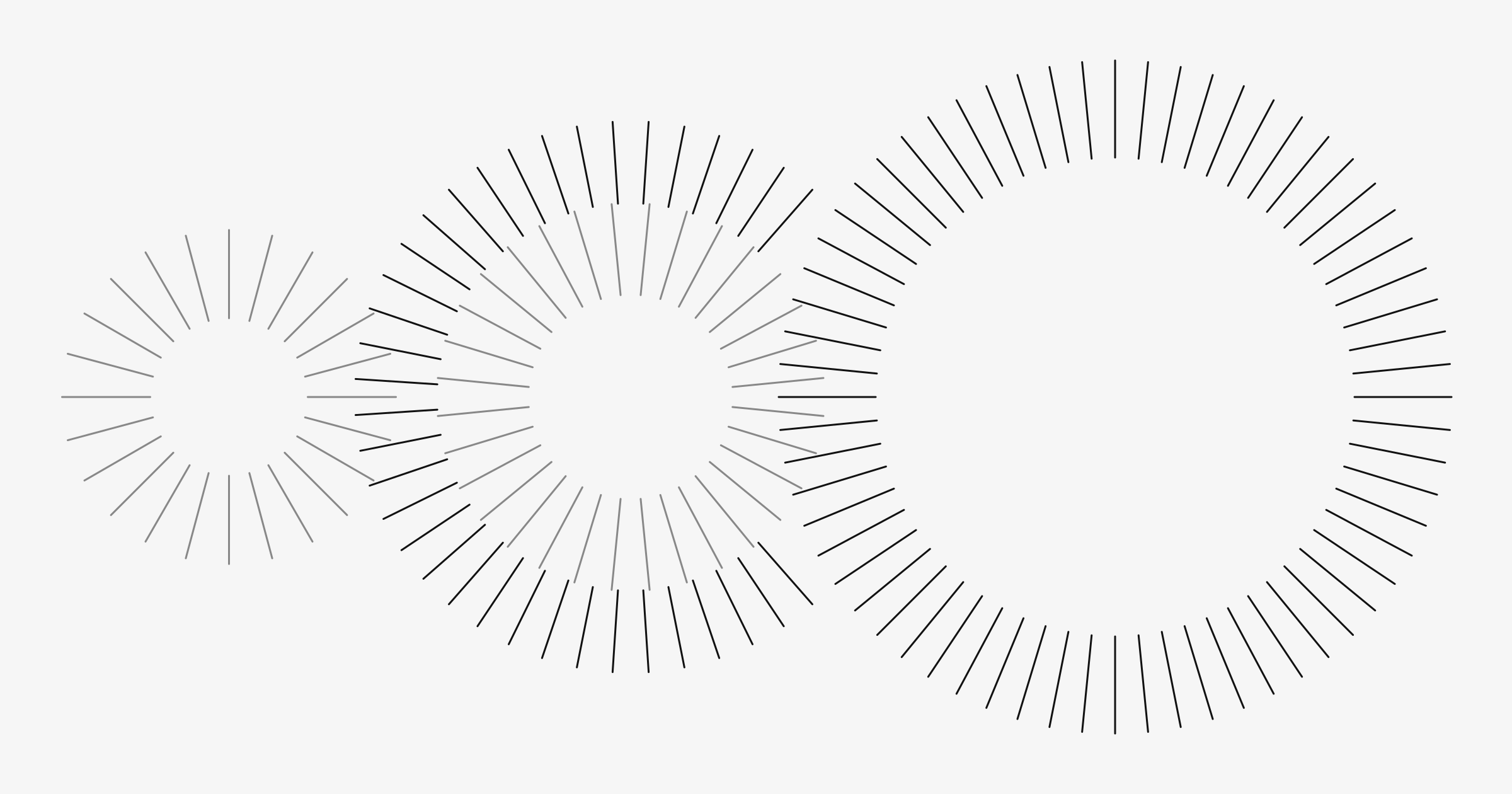
- After getting the still image just right, we translate the system into motion.
this looks amazing. now can you create an animated version? want the gears to rotate CW or CCW per how gears operate. want it to rotate slowly, and form a seamless loop
let’s crop it at the shortest loop possible, so that the file size can be much smaller too. does it work to just loop it at one spoke, or do we need multiple spokes for 1 seamless loop?
i like the speed, but the long frame duration makes it jumpy. need the same timing, but make it a lot smoother.
should we adjust spoke counts so it loops more quickly? or this is best we’re gonna get
actually let’s undo that. whole spokes are fine. but maybe what’s bothering me is how they jump in abruptly. anything we can do about that?
i mean, was wondering about a fade in/out, or something.
- Finally, we optimize the animation into a usable asset.
can we try 30fps? make the fades less long, just a subtle quick one to depop
pretty long GIF duration, so it’s 5MB even at 1200px wide. any other optimizations we can do? ran it through gifsicle already.
Final animated graphic.
The prompts above are an edited selection from a small and straightforward project. Larger projects can stretch across weeks and hundreds of exchanges, with several detours and dead ends along the way. But the rhythm remains the same.
That feedback loop between imagining, seeing, and building has become dramatically shorter. And suddenly, a whole world of ideas is within reach.
And yet, no matter how powerful our tools become, the seed of the idea always starts somewhere human.
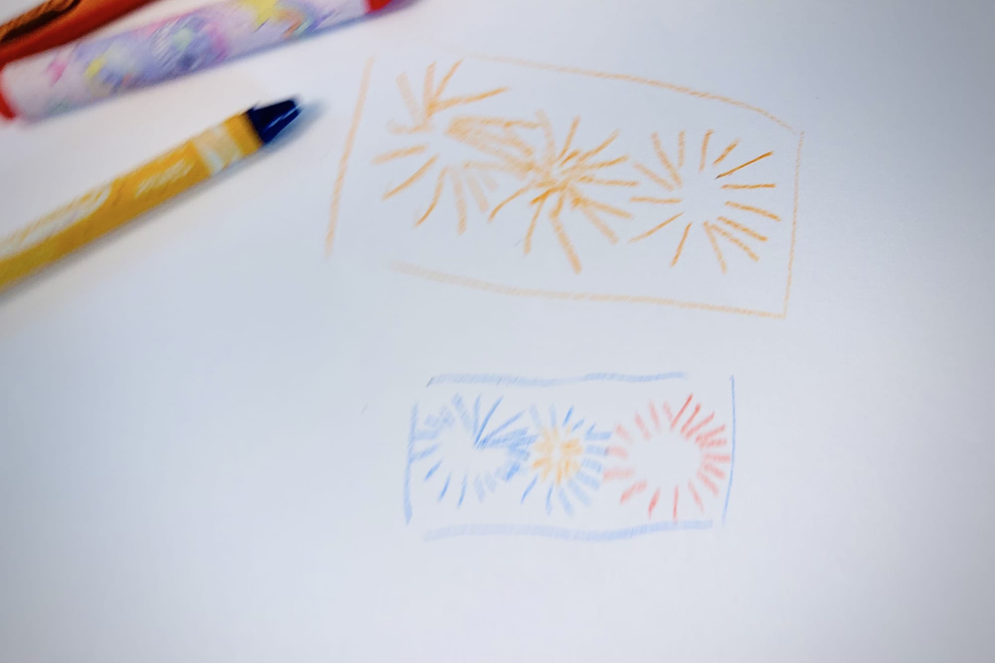
I’ve found there’s just no substitute for that initial period of thinking deeply about a design problem, sitting with it, putting it down and coming back to it, evaluating it, sketching it out on paper. Before the code, there’s the sketch. To this day, I’ve not yet achieved a good result when letting AI design a concept from scratch.
The designer is still ultimately responsible for taste, judgment, and deciding what’s worth creating.